Colored CD Jewel Cases - history, Examples, and Why They Exist
This article discusses the use of colored plastic components in CD jewel cases, focusing on mainstream U.S. rock and pop releases.
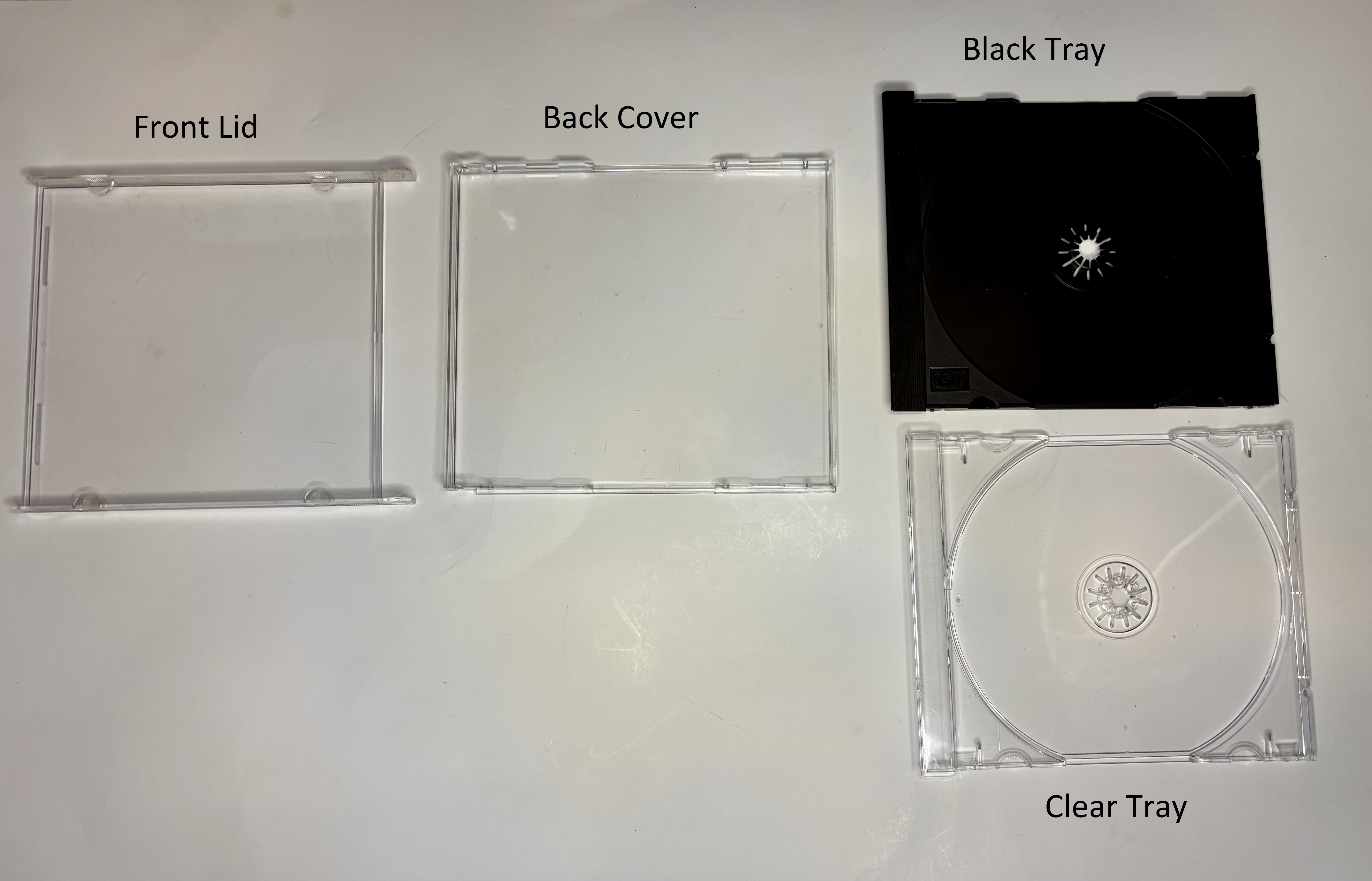
A standard CD jewel case consists of three plastic parts that snap together: the front lid, the tray, and the back cover. From the early 1980s until the early 1990s the tray was usually an opaque charcoal or black while the other two pieces were clear. After the mid-1990s it became common for all parts to be clear.
However, a small number of CD releases used colored jewel case components. Any or all of the three plastic parts could be tinted, either translucent or opaque. While this obviously has no effect on the music, it contributes significantly to the visual impact of the CD both in hand and on the shelf.
It is important to realize that use of anything other than the standard clear pieces and black or clear tray would add cost. Probably just pennies per CD, but this would be significant for a large-scale release from a major label, and even for small indie labels the cost would be an important financial consideration. The point is this was a deliberate decision, either for marketing or design reasons, and as collectors we should recognize and document these variants.
The use of color in jewel cases is poorly documented in online databases. For example, Discogs focuses on the disc and printed materials while jewel case tint or tray color is often ignored or buried in user notes. Part of the reasoning for this is that cases can be swapped, but the same is true of booklets and tray cards, yet those are still considered as defining elements of the release. Because many colored cases were part of the original release, and in some cases part of the artistic vision of the CD, it is important for the collector community to describe these variants.
Sometimes the colored component was only used for part of the initial run, reverting to standard clear and black components later.
In the United States, within a year or two of their introduction CDs in stores were usually displayed in a longbox which hid much of the jewel case. The longbox was a cardboard outer sleeve that allowed the CDs to fit into the old vinyl record bins of the day. In the early 1990's the longbox was phased out and the CD case itself became more visible in the retail setting. It was at that time, 1992-93 that interest in colored jewel cases started to increase.
Early Uses of Color
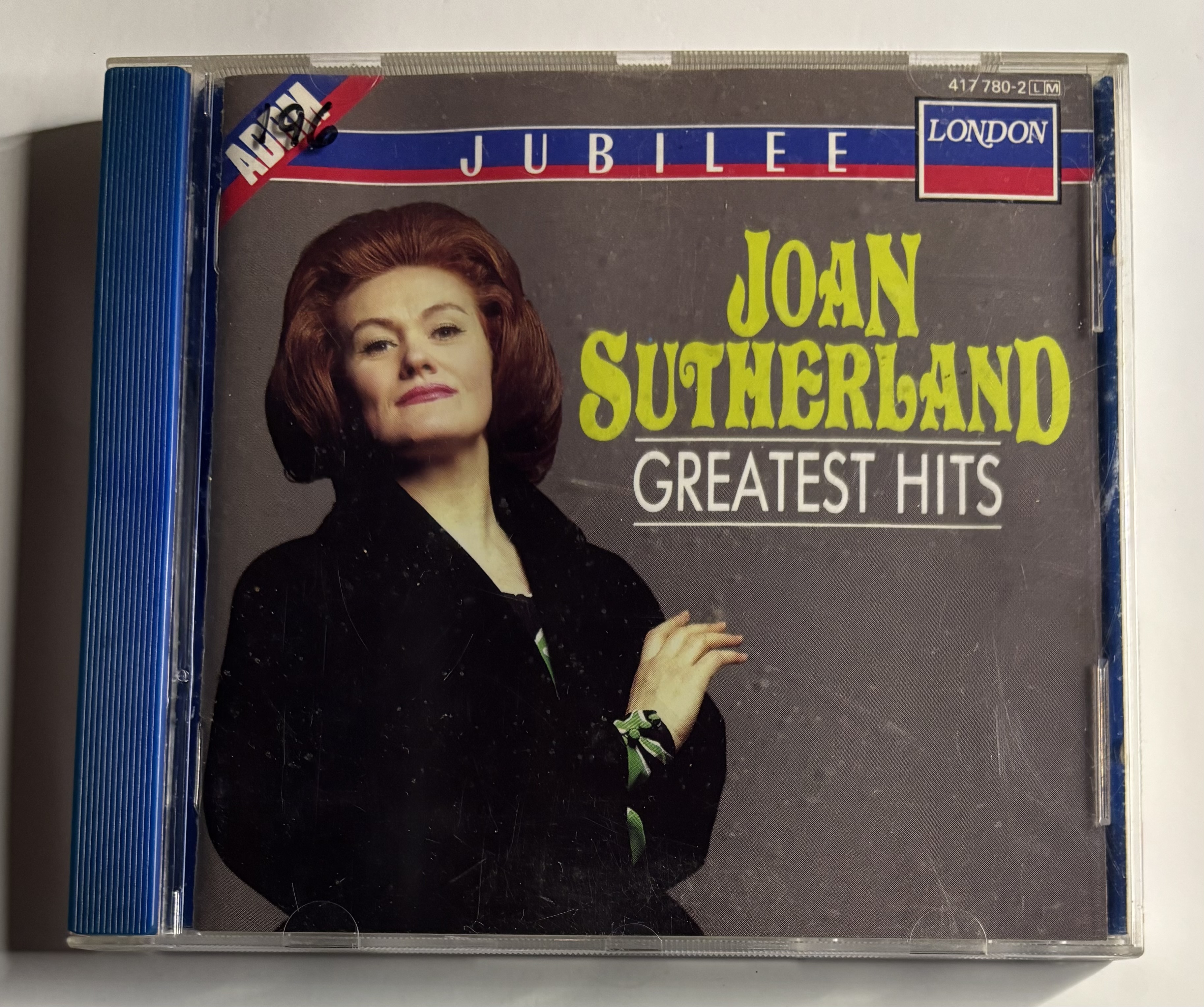
Some of the first examples of the use of "color" was to replace the charcoal tray with a white tray. The white tray was not unusual to see in some genres like classical or children's, for example, even in the late 1980s, but it was very rarely seen in U.S. rock/pop until the mid-1990s.
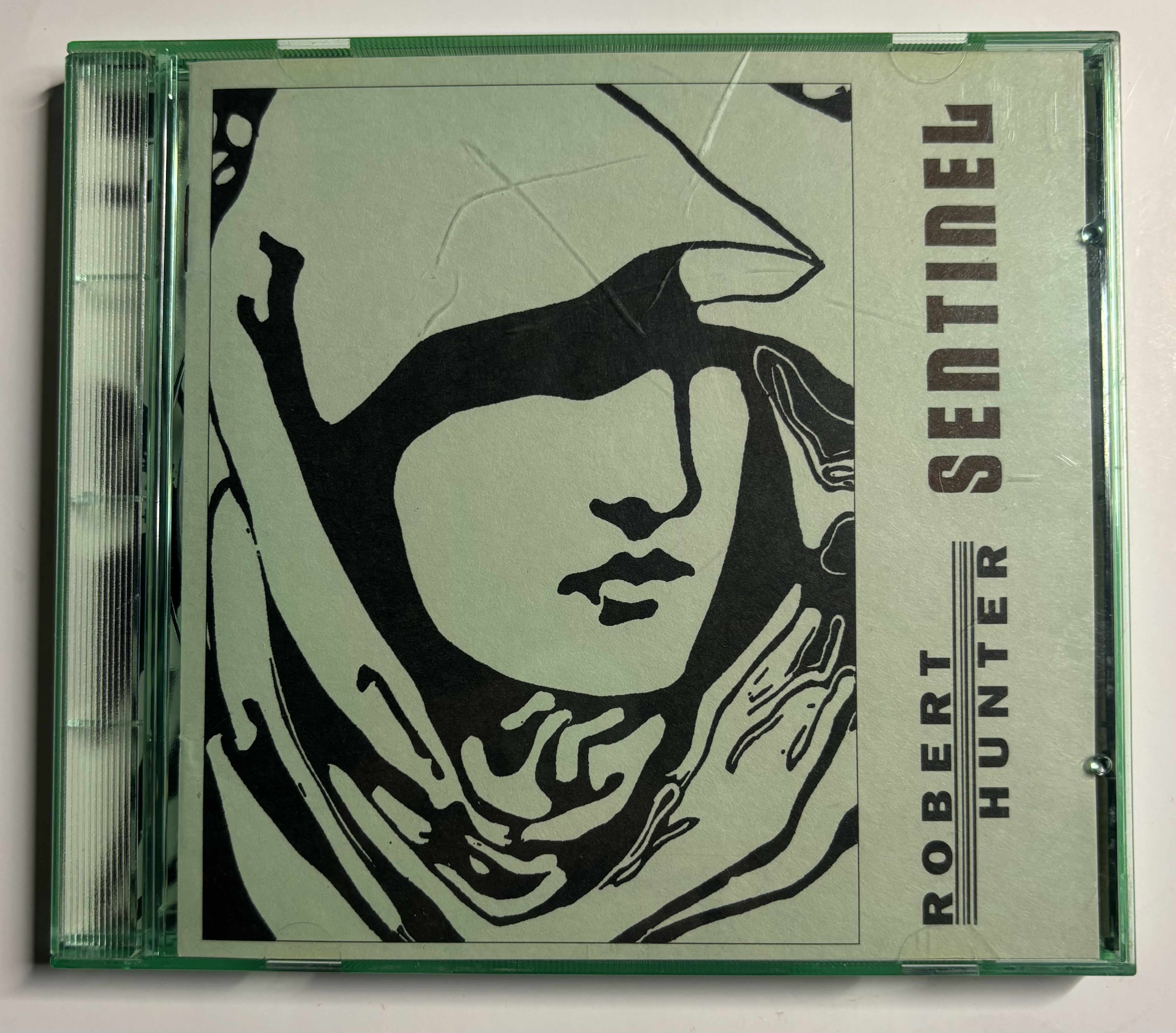
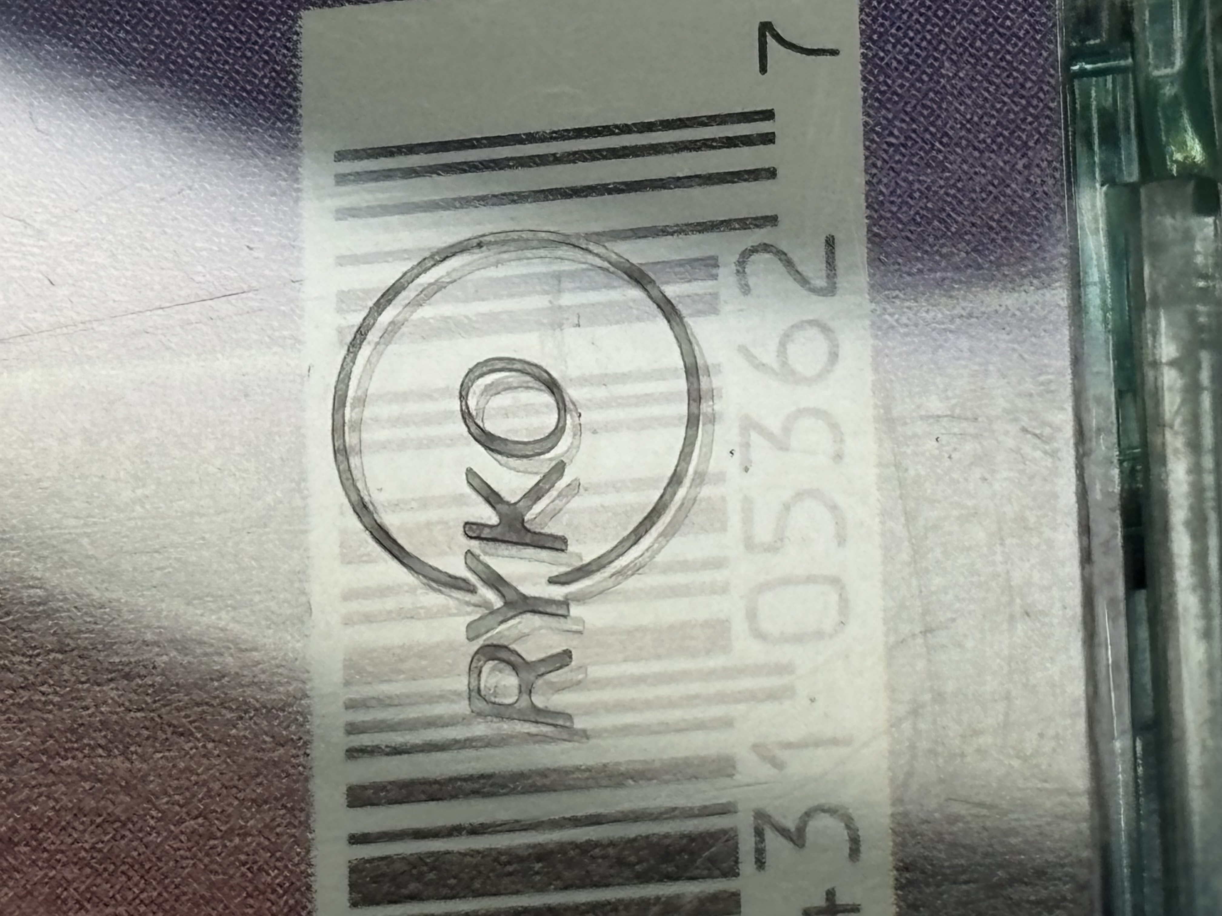
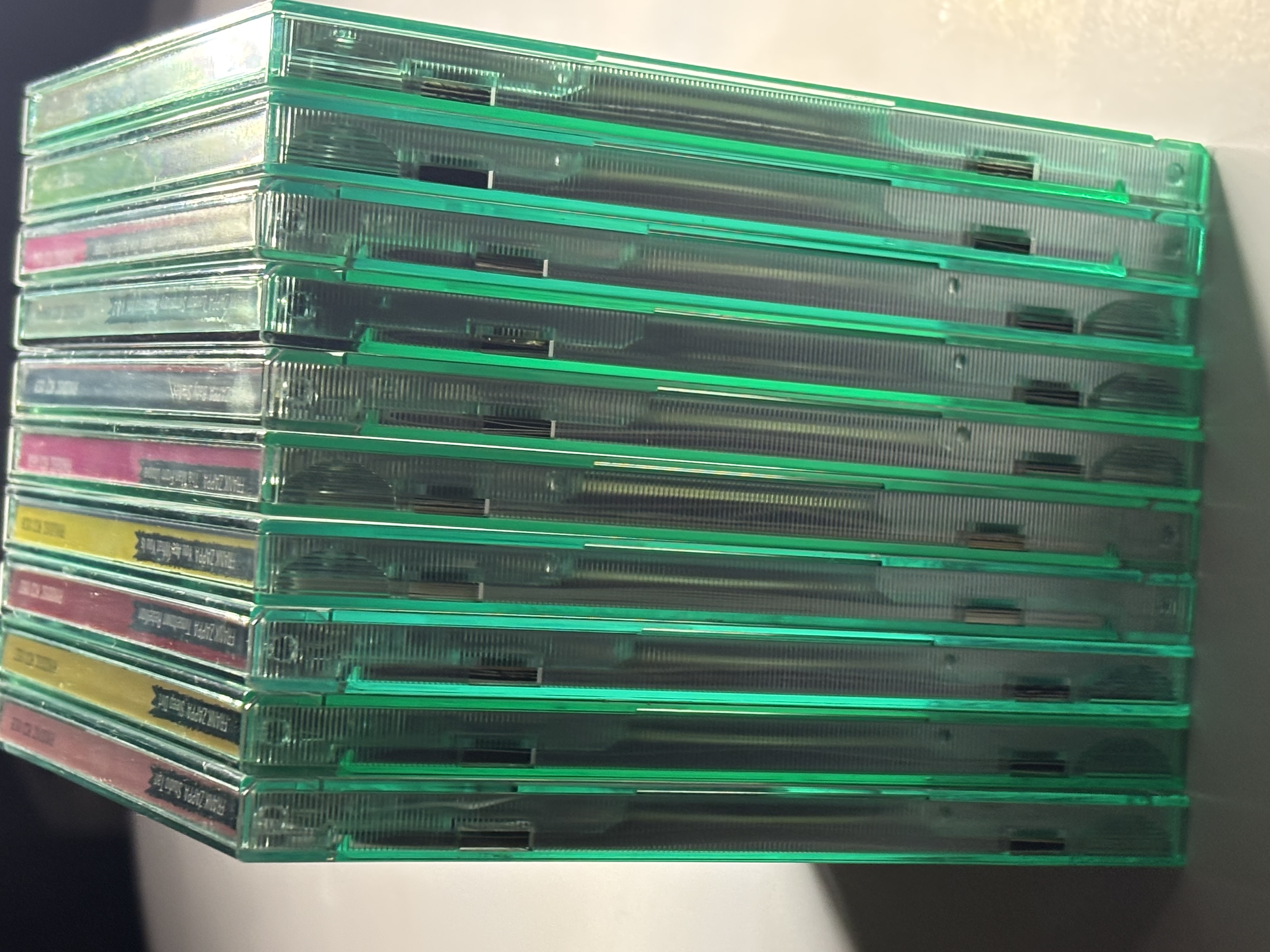
The first widespread appearance of colored CD cases was Rykodisc's iconic green-tinted cases used for almost everything they sold. The green cases were introduced in 1991 and, while timing is unclear, these cases were phased out by the early 2000s. Rykodisc actually trademarked use of the green tinted case. See the photos below, and references 1-3 for additional information on Rykodisc green jewel cases.
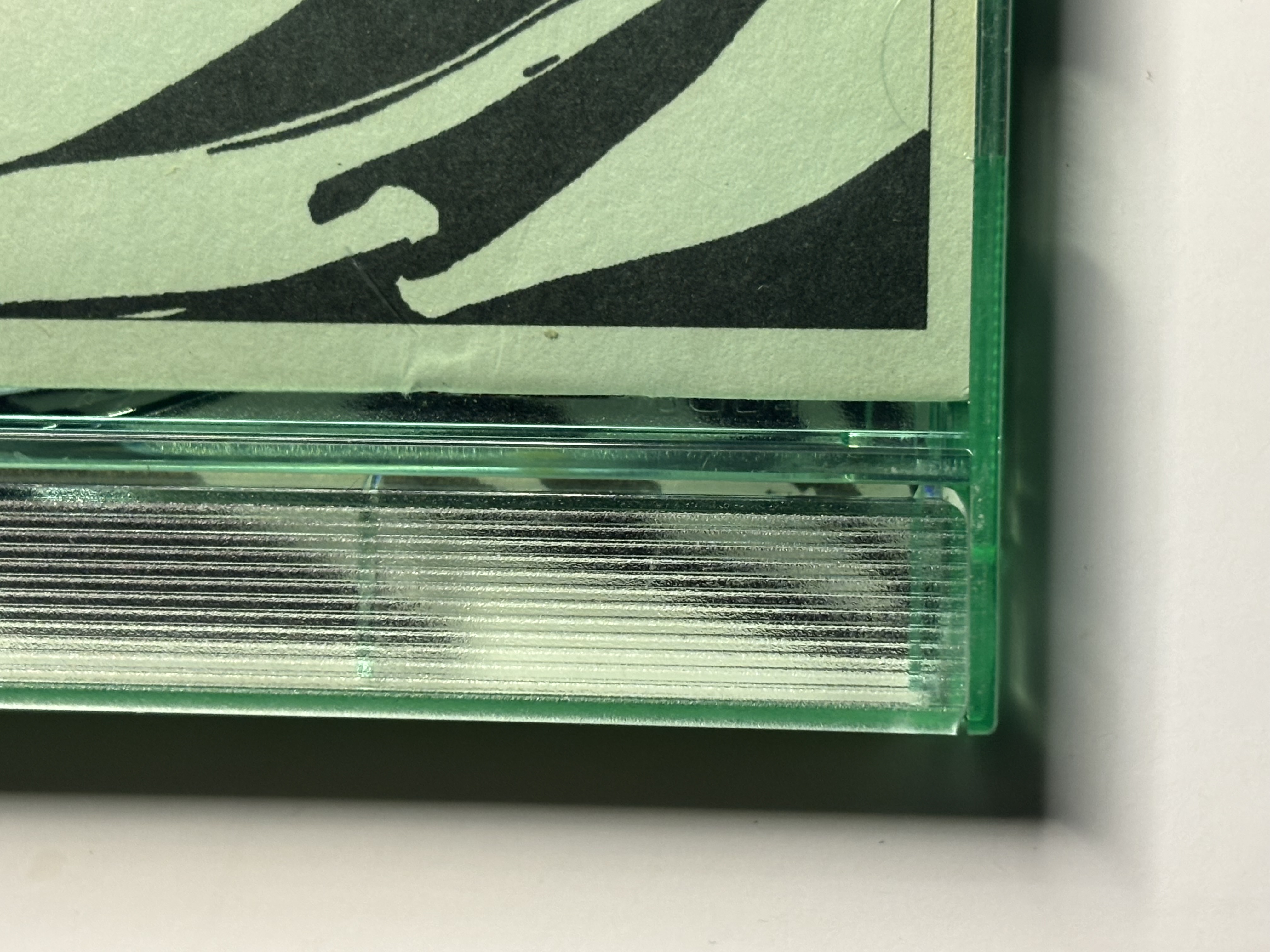
The early-generation green trays are reported by the collecting community to be more fragile, resulting in hinge and hub tab breaks (although Rykodisc disputes that).
While the Rykodisc green cases do generate some collector interest, an important distinction should be made with other later colored cases. The Ryko packaging is not an artistic choice tied to an individual album; it is label-wide branding covering the entire catalog. Later colored cases were chosen as an artistic extension of a specific release, whether by the artist, a design team, or the label. It is more akin to other marketing-related design choices such as the red cassette cases used by Arista, or the vinyl paper labels which usually use the same design for each record label (e.g. "rainbow Capitol label," spiral Vertigo label, etc.).
From Branding to Album-Specific Design
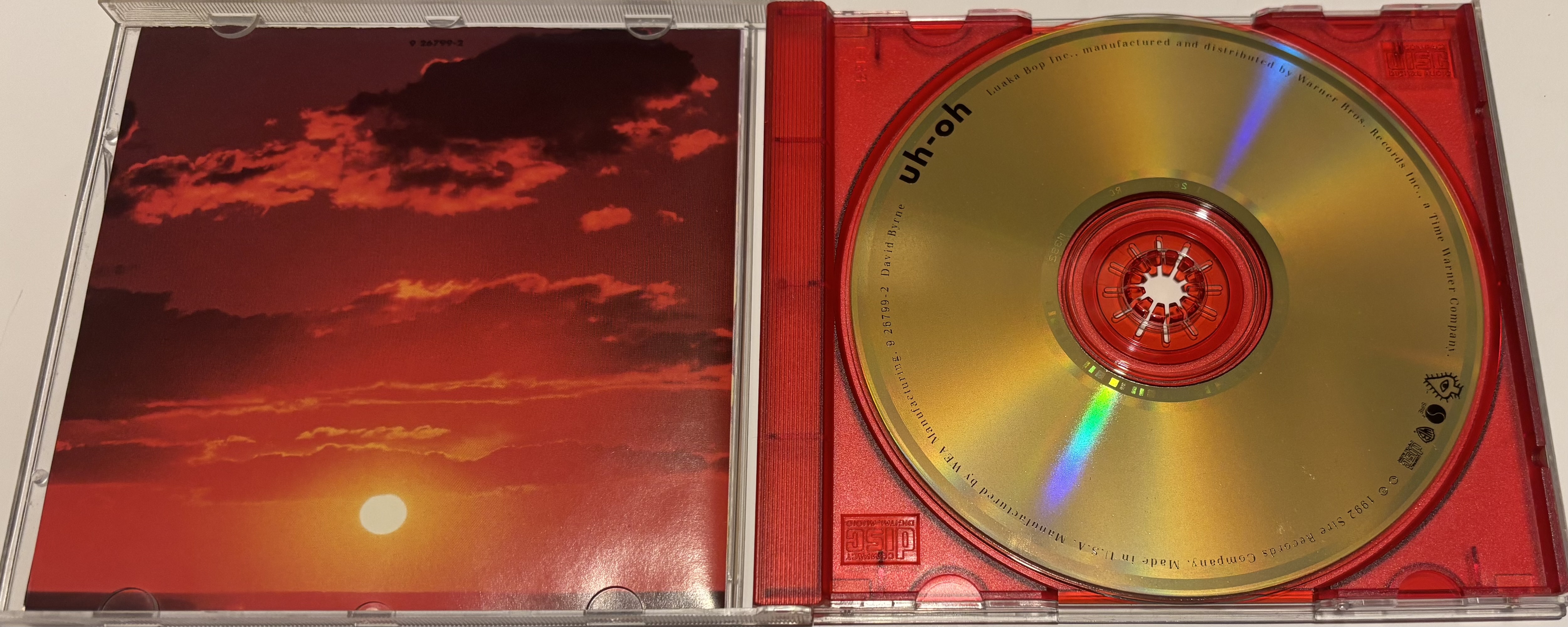
In March 1992 David Byrne's Uh-Oh was released with a translucent red tray chosen to match the album's graphics. When the jewel case is opened, a sunset photo is revealed on the left, and the golden-yellow disc sitting in the translucent red tray is on the right, creating a cohesive and pleasing design. This is one of the first documented U.S. releases to use a colored tray as part of an artistic concept rather than simply label branding. It is arguably one of the better design uses of colored jewel case components ever released.
By 1993 the phase-out of longboxes was in full effect and more attention was being paid to the "naked" CD packaging.
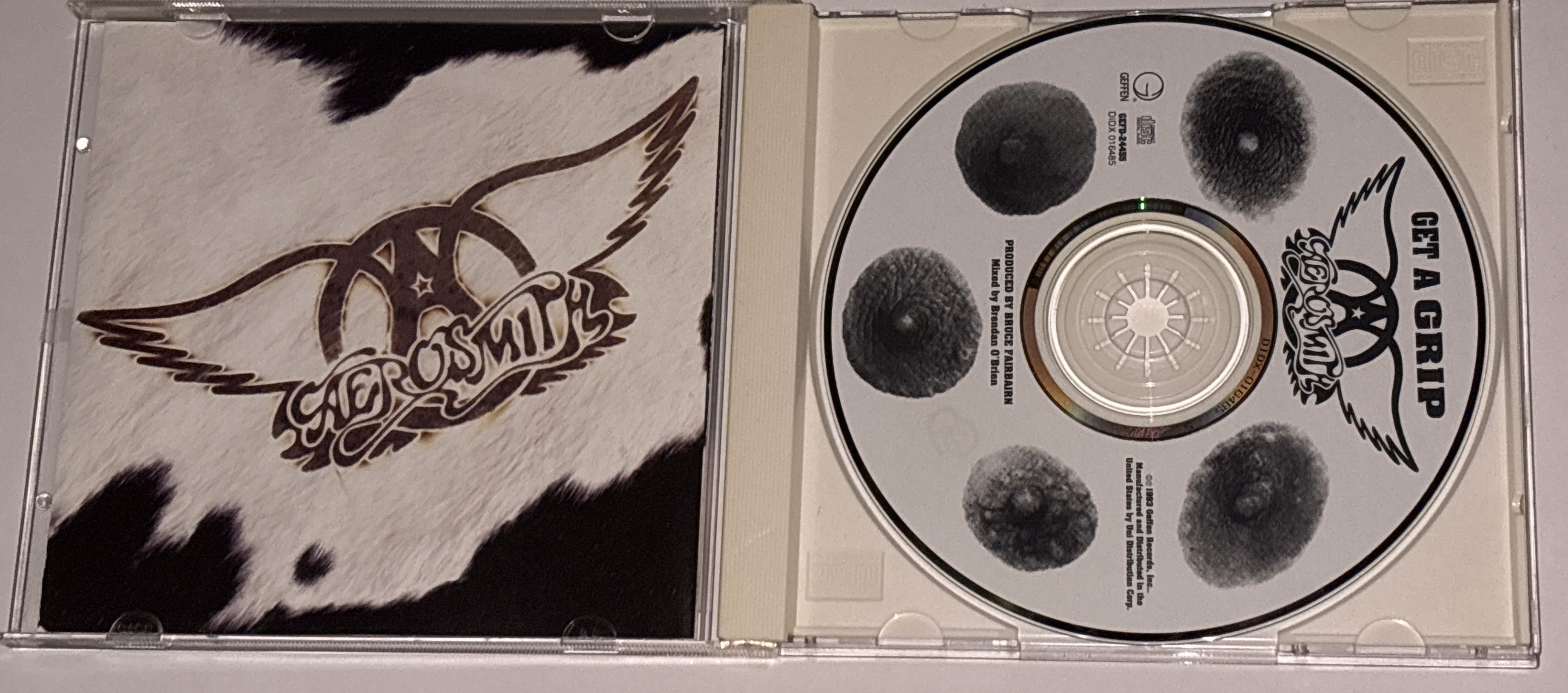
An early standout in this regard was Aerosmith - Get a Grip. A limited (albeit quite widely distributed) edition of the CD was available in a faux cowhide cover. Even the standard issue had (at least in many cases) a white tray. As mentioned before, use of the white tray was unusual in the rock/pop market. The white tray tends to yellow with age and finding bright white examples can be challenging. The success of this release may have increased interest in using jewel case design, including color, as a way to enhance sales.
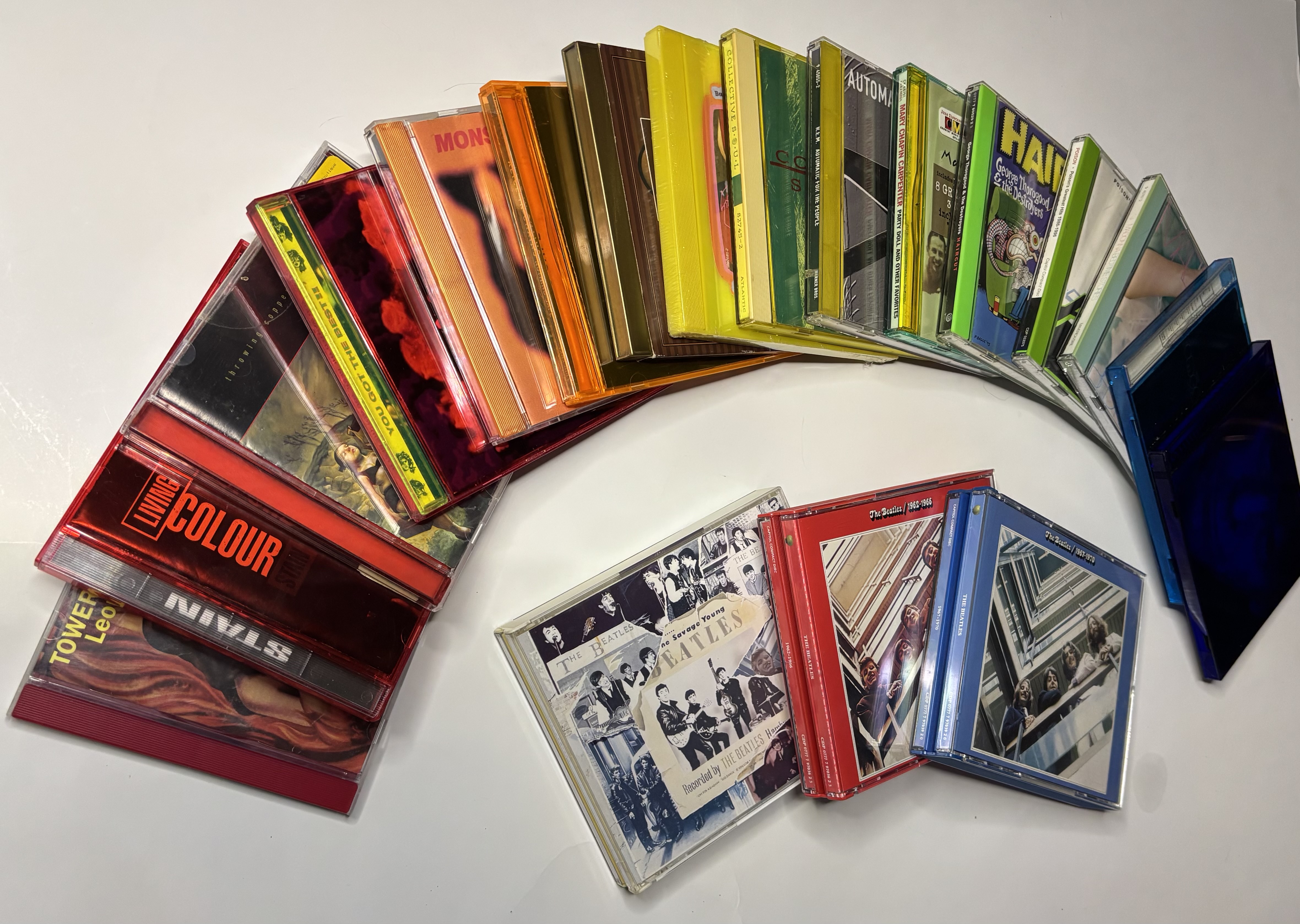
At around the same time Living Colour - Stain was issued in a translucent red case (front and back) with a clear tray.
A real watershed occurred in the fall of 1993 when Pet Shop Boys released Very in an opaque bright orange, textured jewel case. This proved to be popular and was nominated for several design awards. At nearly the same time the Beatles Red and Blue albums were released on CD using opaque red and blue fatbox cases. The Beatles red and blue design did not win any awards but was very widely distributed with high visibility in the market.
After these 1993 releases the floodgates opened, and numerous releases with colored trays and cases were made, resulting in a golden age lasting from about 1994-2000.
Timeline of Notable Colored Jewel Cases
It is important to note that this list is by no means exhaustive.
Pre-1991
- Colored trays, usually white but others are known - numerous releases in classical and other genres, but very uncommon in rock/pop.
1992
- Rykodisc first-generation green translucent case and tray (ribbed and frosted tray).
- David Byrne - Uh-Oh - red translucent tray.
- R.E.M. - Power to the People - yellow translucent tray.
1993
- Aerosmith - Get a Grip - white tray (also faux cowhide limited edition).
- Living Colour - Stain - red translucent case, clear tray.
- Pet Shop Boys - Very - opaque orange molded, textured case and tray.
- Beatles Red and Blue compilations - opaque red and blue fatbox trays.
1994
- R.E.M. - Monster - opaque orange tray.
- Live - Throwing Copper - translucent red tray.
- Madonna - Bedtime Stories - opaque light aqua/teal tray. This tray is often found discolored with age.
- Rykodisc introduces second-generation green case and tray (clear, polished tray) with "Ryko" embossed on the back of the case.
1995
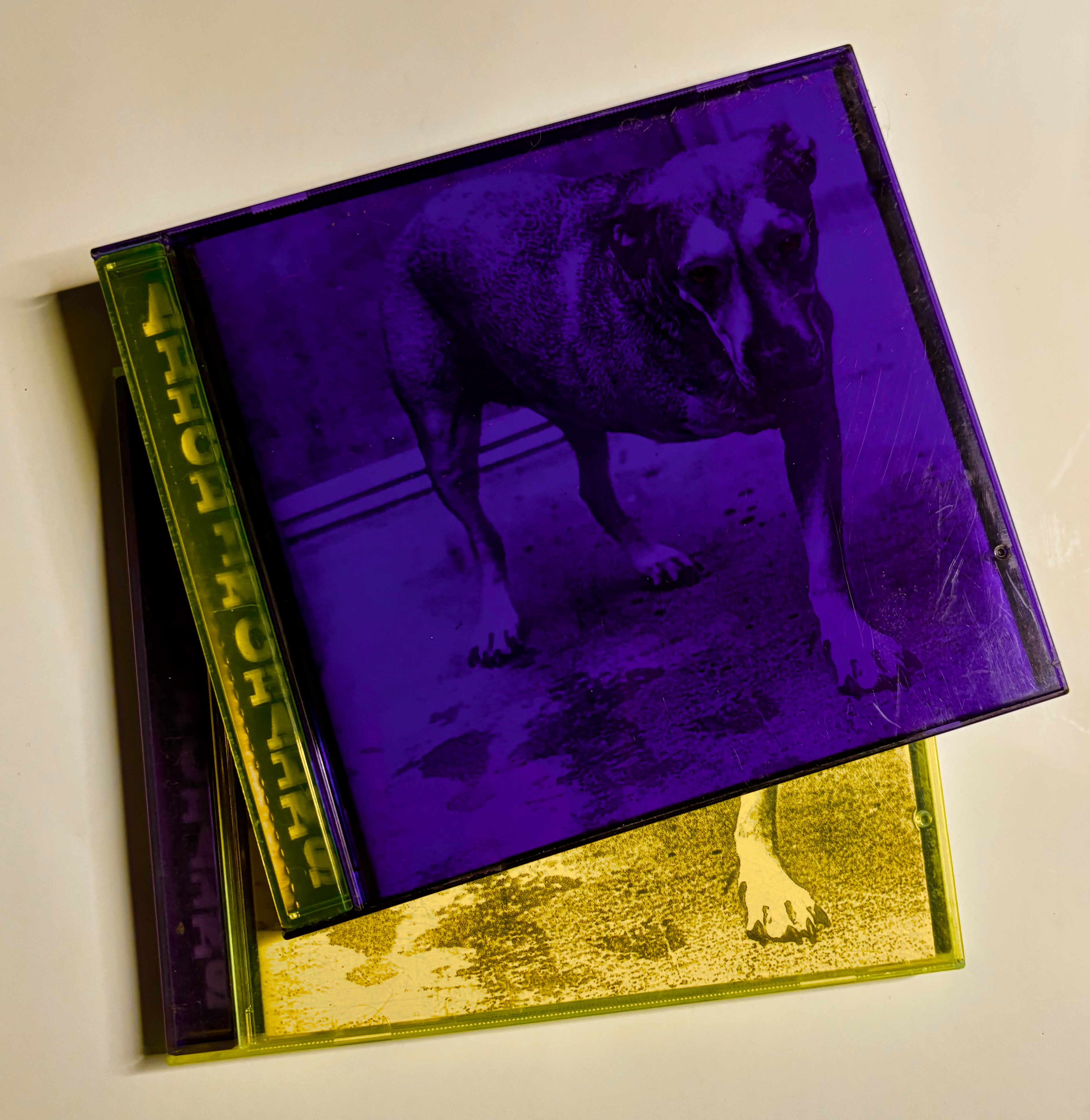
- Alice in Chains - Tripod (self-titled) - two versions, all translucent plastic: purple case with yellow tray, and yellow case with purple tray.
- George Thorogood - Haircut - opaque lime green tray.
- School House Rock! Rocks - opaque yellow case.
- Collective Soul - Collective Soul - translucent yellow case, opaque cream tray.
- Beatles - Anthology 1 - opaque white fatbox tray.
1996
- Lou Reed - Set the Twilight Reeling - dark blue translucent case.
- Poison - Greatest Hits 1986-1996 - opaque bright green tray.
- Beatles - Anthology 2 and Anthology 3 - opaque white fatbox trays.
- Kiss - You Wanted the Best, You Got the Best!! - translucent red case, translucent yellow tray. Emblematic of the use of color for shock impact, a gaudy display to stand out on a shelf. Completely in line with the Kiss brand but not integrated with the design of the rest of the CD art. Contrast this with Uh-Oh.
1997
- Tower of Song: The Songs of Leonard Cohen - translucent red tray.
- Primus - Brown Album - opaque gold/brown with metallic look, case and tray, blank with art printed on slipcase.
1998
- Marilyn Manson - Mechanical Animals - translucent blue case.
1999
- Alice in Chains - Nothing Safe - translucent orange case.
- Mary Chapin Carpenter - Party Doll - translucent green case, translucent yellow tray.
View the full Colored Jewel Case Gallery
What This Means for the Collector
In 2025, most casual collectors are not focused on jewel case variants, and most of these releases remain inexpensive and can be found with little or no price premium over standard packaging, offering collectors a low-cost way to add interest to their collections.
Colored cases are easy to spot in stacks of CDs. However, collectors typically scan for titles, and it can be easy to miss unique case coloring. For that reason it may be useful to do a second scan through the stack looking specifically at the case. Because of the ease of picking them out, should jewel case color ever become more important to collectors it would be expected that these examples would be removed from circulation relatively quickly.
Colored trays are a little trickier to spot. If the CD is oriented hinge side facing out, then a sliver of the colored tray is visible and easy to spot. But if oriented opening side out, the tray is hidden. The best approach may be for the collector to educate oneself on which CDs are known to have colored cases, then pull the title to confirm.
Caveat: Jewel cases can be replaced. Typically we rely on the existence of these colored releases being described in Discogs, eBay, or other online sites to confirm that a particular colored case was part of the original pressing. But unless the example in hand is factory sealed, it is difficult to confirm it is all original.
Epilogue
By the early 2000s, the creative energy for CD packaging design shifted to digipaks and other specialty packaging, effectively ending the era of the colored CD jewel case.
Selected References
- USPTO Trademark serial number 74331497 to Rykodisc, Inc. "The mark consists of the color green-tint which is used over the entire surface of the goods" first use in commerce Nov. 1, 1991. Registered May 31, 1994. Canceled Feb. 19, 2016.
- Billboard newspaper, July 4, 1992 - p. 76. States that Ryko began issuing all its new titles in transparent, green-tinted jewel boxes with the release of "Devo Hardcore Vol. 2" last August and it plans to issue new pressings of catalog material in the same boxes. This same article also mentions David Byrne's Uh-Oh.
- Billboard newspaper, Oct. 10, 1998 - pp. 50-52. Discusses Rykodisc's green jewel cases, including a comment that "now seven years old, the green box is in no danger of being replaced."