The CD Spine: What You See Most - Observations from a CD shelf
When you see a CD at the store, or in your personal collection on a shelf, there is one feature that is nearly always on display - the spine. Not the cover, not the music - the spine. Over its lifetime a CD will spend well over 99% of its time displaying only its spine. This article will discuss this underappreciated component of the physical CD.
Let's be honest, collectors focus on the music first. The cover second. The liner notes or booklet third. The packaging fourth. And probably a few other things, and then finally the spine. But the reality is that the spine is the feature we see most often and it deserves some attention.
"Spine scanning" is the CD equivalent of vinyl crate digging. Beyond general knowledge, an understanding of the history and details of spine appearance can help the collector know better when to pull a disc for a closer look.
The article will focus on the jewel case spine. Jewel cases represent somewhere around 80% of all CDs produced over time. Digipak and other packaging are a little different and will be covered in a separate article.
The spine performs an important function, that of allowing the CD to be identified while it sits on a shelf alongside hundreds or even thousands of other CDs.
The spine tells us a lot, although not everything, about what is inside. Typically the title, the artist, the label, and a catalog number. Some things can also often be inferred, like age, even pressing or mastering.
Usually, however, the spine does not reveal everything, and inspection of the CD is required to determine the exact pressing.
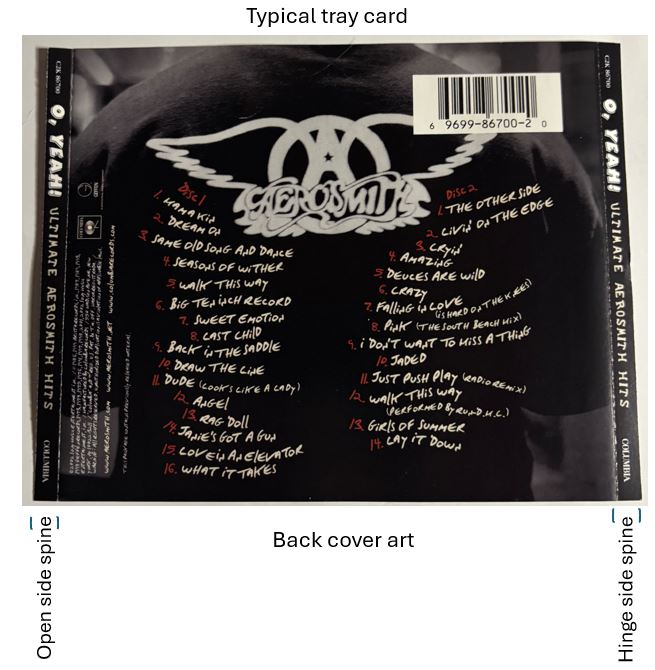
Physically the visible portion of the CD spine is about 1/4 inch wide and 5 inches long. A CD has two spines, one on the hinge side and one the opening side of the jewel case. In a stroke of genius both spines are usually identical, meaning that it doesn't matter which way the CD is oriented on the shelf, saving the CD collecting community thousands of hours of shelf rotation labor. Also doubles your chances of the spine being face out.
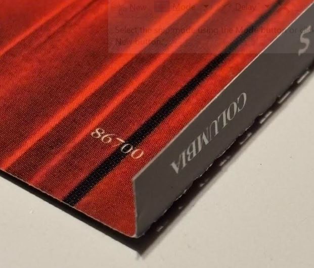
The spine is not a separate piece, it is part of the tray card (visible as the back of the CD case). The ends are folded up to create the spine label. Often guide marks or light perforations are added to help the spine fold cleanly.
For CDs with black trays the tray card is usually only printed on one side. For clear trays the card is printed on both sides. This allows for a bonus feature, where the reverse side of the spine is visible through the front of the case. Many times this is either not printed, or is a bleed over of the back art. Sometimes words are actually printed there.
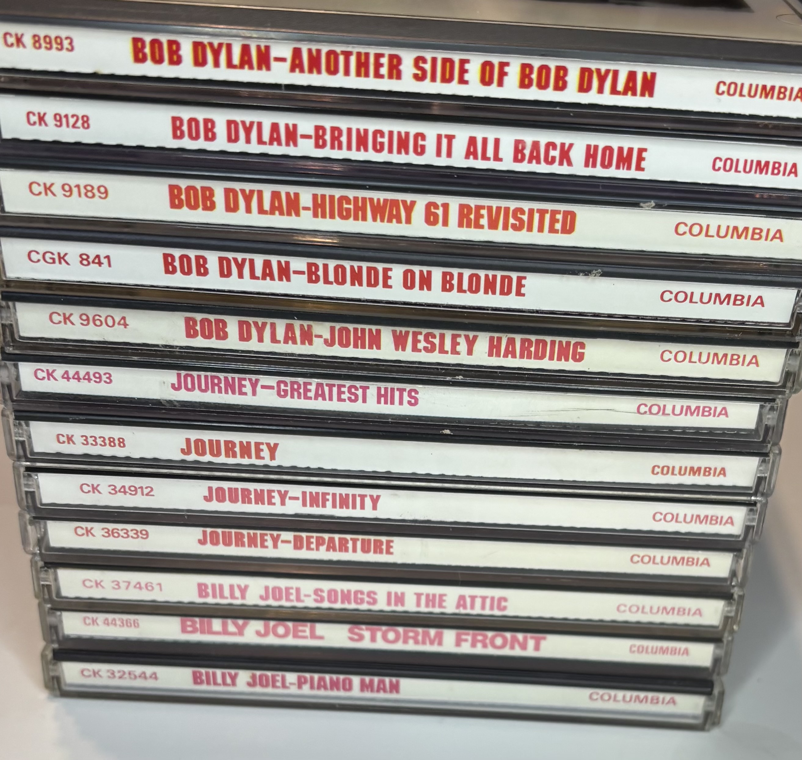
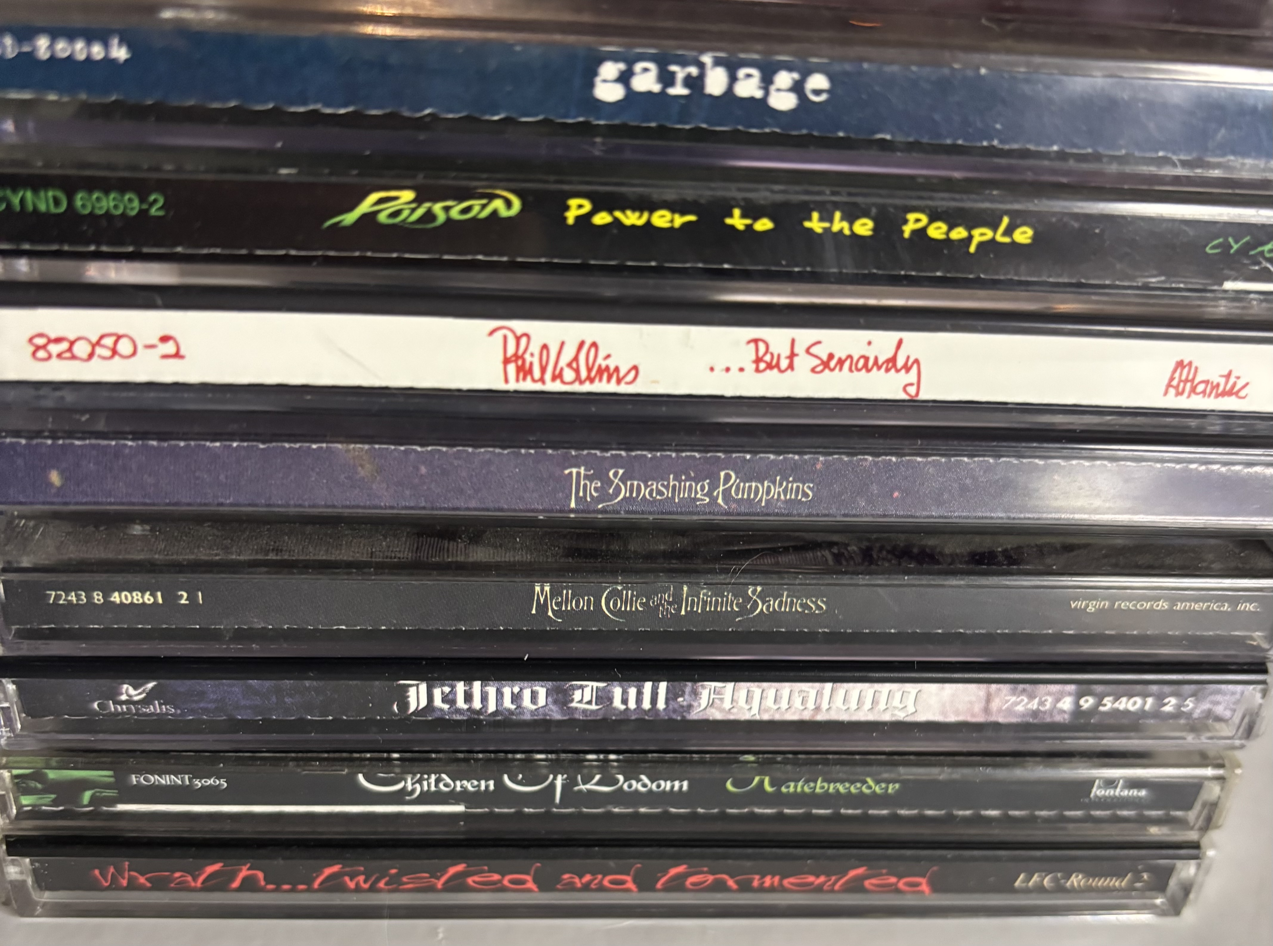
Some spines are purely informational, black text on white background. I suppose this could be a stylistic choice but there are some spines which have more artful designs.
Broadly speaking spines can be categorized as follows:
- Informational - plain text, artist, title, label, catalog number.
- Design enhanced - most common type after about 1990. Primarily informational but often incorporating color or some design element from the front cover.
- Label centric - very common, a similar look for all the releases from the same label and or subsidiary (Island, Impulse).
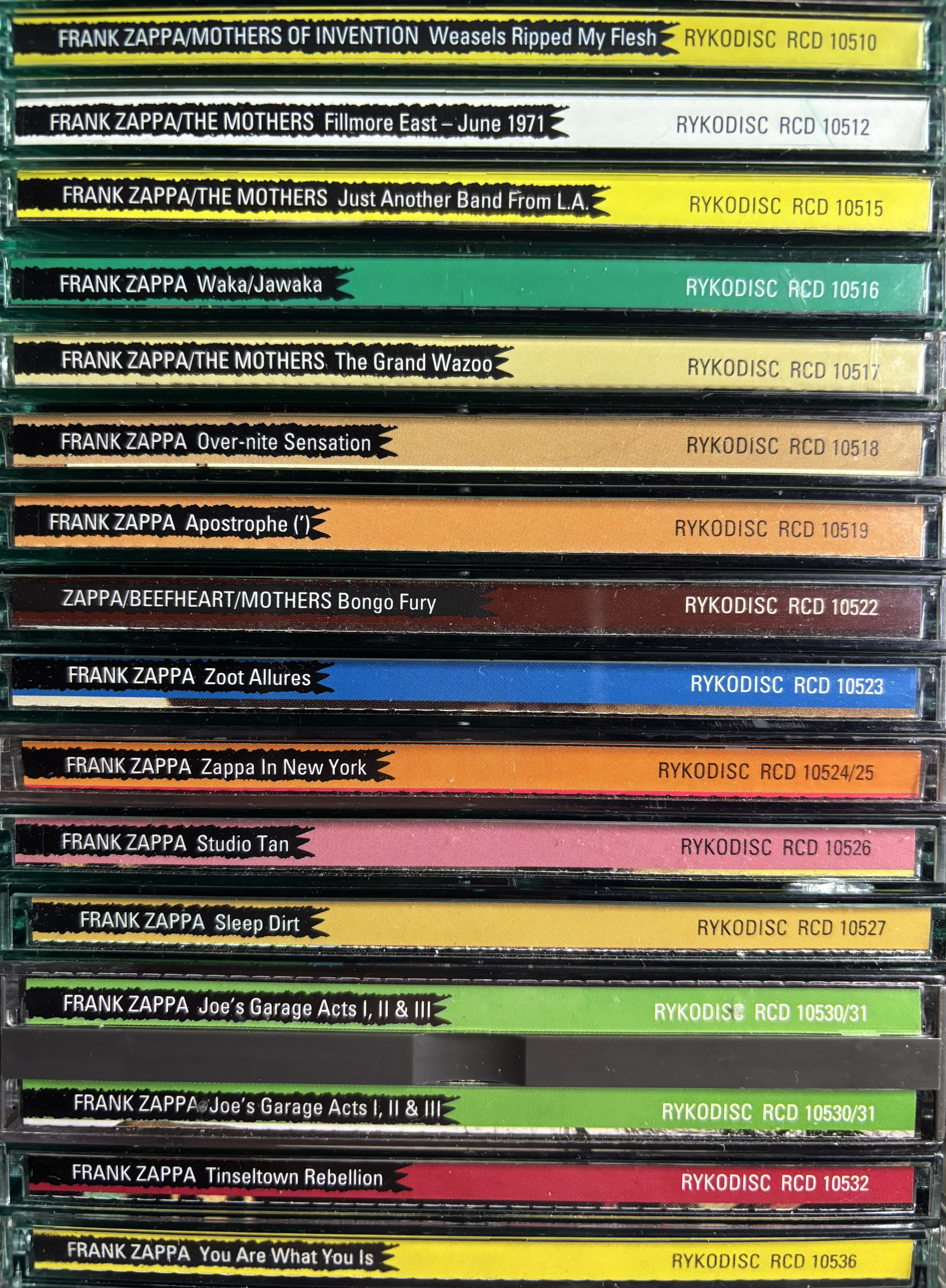
- Artist centric - much rarer, a similar look for all releases from the same artist (Zappa 1995 releases, Rolling Stones ABKCO releases).
- Decorative fonts - script, gothic, modernistic, etc. Can be harder to read. Frequently found with heavy metal but seen elsewhere.
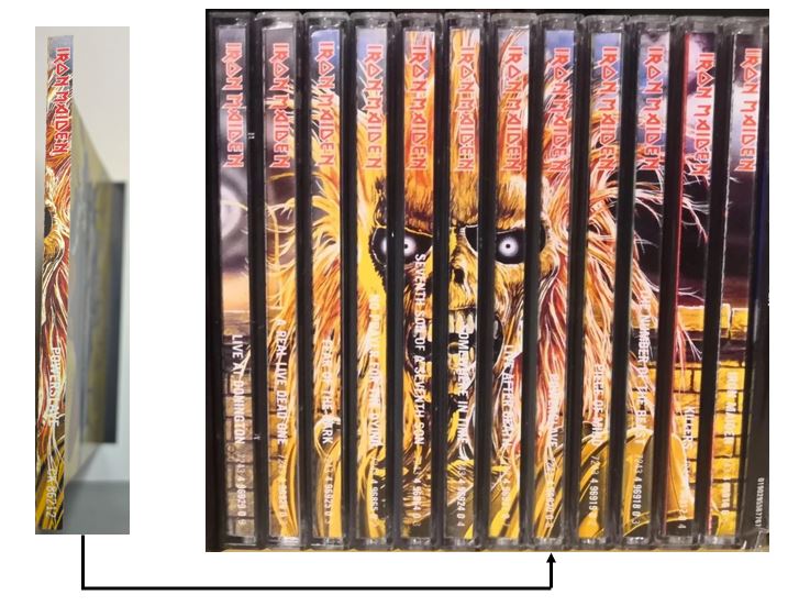
- Artistic - rarest of all, a coordinated group of spines that together form a miniature piece of art, images, patterns, etc. (Iron Maiden 1998 remasters, Megadeth 2004 remasters).
Most spines exhibit characteristics of multiple categories and fall somewhere between purely informational, label centric, and slightly decorative fonts.
But below are some of the more clear cut examples to show the range.

The spine can provide a clue about the age or pressing, often the original pressings are in plain text while later pressings included a more stylized font and bleed over of cover art.

While all of an artists releases may have the same spine design, if other releases from the same label have the same design then this is considered a label centric design.
Using more decorative fonts is one way CDs are able to maintain some individuality and this can be useful to the collector. For example, many heavy metal releases use a gothic or similar font. If that is what you are looking for, then when scanning CDs, if you see a font like that for a band you do not recognize, it may be worthwhile to pull it and check it out.
The most ambitious use of spine art, really the pinnacle, is the Iron Maiden 1998 remasters release of 12 studio and live albums. When displayed on a shelf in roughly chronological order of release the spines create a mural of Eddie. In what seems to be a missed opportunity, this type of coordinated spine art has rarely been seen since.
It is hoped that this discussion enhances your understanding and appreciation of the CD spine, and maybe even improves your spine scanning skills for the next time you browse a shelf.